This repository was archived by the owner on Jul 23, 2026. It is now read-only.
Repository navigation
This repository was archived by the owner on Jul 23, 2026. It is now read-only.
[create-theme]: simhae #2106
Description

Name
Simhae
Description
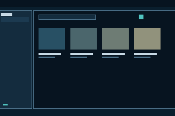
A calm dark blue theme with styled sidebar reveal and URL popup.
Homepage
https://github.com/spearkkk/simhae-zen
Image
https://raw.githubusercontent.com/spearkkk/simhae-zen/main/image.png
Type
- JSON Color Theme
Theme Styles
:root {
  --simhae-base00: #0a1f2e;
  --simhae-base01: #142c3e;
  --simhae-base02: #1c3a50;
  --simhae-base03: #24425c;
  --simhae-base04: #4a6e86;
  --simhae-base05: #c6d8e4;
  --simhae-base06: #d6e2e8;
  --simhae-base07: #ecf0f4;
  --simhae-base08: #c47a72;
  --simhae-base09: #c8945a;
  --simhae-base0a: #c8ae6a;
  --simhae-base0b: #68be92;
  --simhae-base0c: #50c4c0;
  --simhae-base0d: #7896cc;
  --simhae-base0e: #9a7ec8;
  --simhae-base0f: #8c6040;
  --simhae-base10: #071420;
  --simhae-base11: #d08880;
  --simhae-base12: #d4a870;
  --simhae-base13: #d4be82;
  --simhae-base14: #80ccaa;
  --simhae-base15: #68d4d0;
  --simhae-base16: #90aed8;
  --simhae-base17: #ae96d4;

  --simhae-front-app-foreground: var(--simhae-base05);
  --simhae-front-app-background: var(--simhae-base01);
  --simhae-front-app-border: rgba(74, 110, 134, 0.9);
  --simhae-sidebar-reveal-border: rgba(74, 110, 134, 0.68);
  --simhae-sidebar-reveal-border-muted: rgba(74, 110, 134, 0.42);

  --zen-primary-color: var(--simhae-sidebar-reveal-border) !important;
  --zen-colors-primary: var(--simhae-sidebar-reveal-border) !important;
  --zen-colors-secondary: var(--simhae-base0d) !important;
  --zen-colors-tertiary: var(--simhae-base02) !important;
  --zen-colors-border: var(--simhae-base03) !important;
  --zen-colors-hover-bg: var(--simhae-base02) !important;
  --zen-colors-toolbar: var(--simhae-base00) !important;
  --zen-main-browser-background: var(--simhae-base00) !important;
  --zen-themed-toolbar-bg: var(--simhae-base00) !important;
  --toolbar-bgcolor: var(--simhae-base00) !important;
  --toolbar-color: var(--simhae-base05) !important;
  --lwt-accent-color: var(--simhae-base00) !important;
  --lwt-text-color: var(--simhae-base05) !important;
  --lwt-toolbar-field-background-color: var(--simhae-base01) !important;
  --lwt-toolbar-field-color: var(--simhae-base05) !important;
  --lwt-toolbar-field-border-color: var(--simhae-base03) !important;
  --lwt-toolbar-field-focus: var(--simhae-front-app-background) !important;
  --lwt-toolbar-field-focus-color: var(--simhae-front-app-foreground) !important;
  --urlbarView-highlight-background: var(--simhae-base02) !important;
  --urlbarView-highlight-color: var(--simhae-base07) !important;
  --urlbarView-separator-color: var(--simhae-base03) !important;
  --arrowpanel-background: var(--simhae-base01) !important;
  --arrowpanel-color: var(--simhae-base05) !important;
  --arrowpanel-border-color: var(--simhae-base03) !important;
  --sidebar-background-color: var(--simhae-base00) !important;
  --sidebar-border-color: var(--simhae-sidebar-reveal-border) !important;
  --sidebar-text-color: var(--simhae-base05) !important;
  --chrome-content-separator-color: var(--simhae-sidebar-reveal-border) !important;
  --toolbar-background-color: var(--simhae-base00) !important;
  --toolbox-background-color: var(--simhae-base00) !important;
  --toolbox-background-color-inactive: var(--simhae-base00) !important;
  --toolbox-text-color: var(--simhae-base05) !important;
  --toolbox-text-color-inactive: var(--simhae-base05) !important;
}

#TabsToolbar,
#nav-bar,
#PersonalToolbar {
  background-color: var(--simhae-base00) !important;
  color: var(--simhae-base05) !important;
  border-color: var(--simhae-base03) !important;
}

#navigator-toolbox {
  background-color: var(--simhae-base00) !important;
  color: var(--simhae-base05) !important;
  border-color: var(--simhae-sidebar-reveal-border) !important;
  box-shadow: none !important;
}

#navigator-toolbox .zen-toolbar-background {
  background: var(--simhae-base00) !important;
  background-color: var(--simhae-base00) !important;
  border: 2px solid var(--simhae-sidebar-reveal-border) !important;
  box-shadow: none !important;
}

#navigator-toolbox .zen-toolbar-background::before,
#navigator-toolbox .zen-toolbar-background::after {
  background: var(--simhae-base00) !important;
  background-color: var(--simhae-base00) !important;
  box-shadow: none !important;
  outline: 2px solid var(--simhae-sidebar-reveal-border) !important;
  outline-offset: -2px !important;
}

.urlbar-background,
#searchbar {
  background-color: var(--simhae-base01) !important;
  border-color: var(--simhae-base03) !important;
  color: var(--simhae-base05) !important;
}

#urlbar[focused="true"] > .urlbar-background,
#urlbar[focused="true"] > .urlbar-input-container {
  background: var(--simhae-front-app-background) !important;
  border: none !important;
  box-shadow: none !important;
  outline: none !important;
}

#urlbar[open] > .urlbar-background,
#urlbar[open] > .urlbar-input-container {
  background: var(--simhae-front-app-background) !important;
  border: none !important;
  box-shadow: none !important;
  outline: none !important;
}

#urlbar[breakout][breakout-extend] {
  background: var(--simhae-front-app-background) !important;
  color: var(--simhae-front-app-foreground) !important;
  border: 3px solid var(--simhae-front-app-border) !important;
  border-radius: 12px !important;
  overflow: clip !important;
}

#urlbar[breakout][breakout-extend] > .urlbar-background,
#urlbar[breakout][breakout-extend] > .urlbar-input-container {
  background: var(--simhae-front-app-background) !important;
  background-color: var(--simhae-front-app-background) !important;
  border: none !important;
  box-shadow: none !important;
  outline: none !important;
}

#urlbar[breakout][breakout-extend] .urlbarView {
  background: var(--simhae-front-app-background) !important;
  border: none !important;
  border-top: 1px solid var(--simhae-front-app-border) !important;
  border-radius: 0 !important;
  box-shadow: none !important;
}

#urlbar[breakout][breakout-extend] #urlbar-input,
#urlbar[breakout][breakout-extend] .urlbar-input {
  color: var(--simhae-front-app-foreground) !important;
}

.urlbarView,
.urlbarView-body-outer,
.urlbarView-body-inner,
.urlbarView-results,
.urlbarView-row-inner {
  background: var(--simhae-front-app-background) !important;
  color: var(--simhae-front-app-foreground) !important;
  border: none !important;
  border-color: transparent !important;
}

.urlbarView-row:hover,
.urlbarView-row[selected] {
  background-color: var(--simhae-base02) !important;
  color: var(--simhae-front-app-foreground) !important;
}

.urlbarView-title,
.urlbarView-url {
  color: var(--simhae-front-app-foreground) !important;
}

.tab-background {
  background-color: transparent !important;
  border: 1px solid transparent !important;
}

.tabbrowser-tab:hover > .tab-stack > .tab-background {
  background-color: var(--simhae-base02) !important;
}

.tabbrowser-tab[selected="true"] > .tab-stack > .tab-background,
.tabbrowser-tab[multiselected="true"] > .tab-stack > .tab-background {
  background-color: var(--simhae-base01) !important;
  border-color: var(--simhae-base03) !important;
}

.tabbrowser-tab[selected="true"] .tab-label,
.tabbrowser-tab[multiselected="true"] .tab-label {
  color: var(--simhae-base07) !important;
}

.tabbrowser-tab[selected="true"] .tab-background::before {
  background-color: var(--simhae-base0c) !important;
}

toolbarbutton,
.toolbarbutton-1,
.urlbar-page-action {
  color: var(--simhae-base05) !important;
}

toolbarbutton:hover,
.toolbarbutton-1:hover,
.urlbar-page-action:hover {
  background-color: var(--simhae-base02) !important;
  color: var(--simhae-base07) !important;
}

toolbarbutton[open="true"],
.toolbarbutton-1[open="true"] {
  background-color: var(--simhae-base02) !important;
  color: var(--simhae-base0c) !important;
}

#sidebar-header,
sidebar-main,
zen-sidebar,
zen-workspaces-button,
#zen-sidebar-top-buttons,
#zen-sidebar-bottom-buttons {
  background-color: var(--simhae-base00) !important;
  color: var(--simhae-base05) !important;
}

#sidebar-box {
  background-color: var(--simhae-base00) !important;
  border: 3px solid var(--simhae-sidebar-reveal-border) !important;
  border-radius: 12px !important;
  box-shadow: none !important;
  overflow: clip !important;
}

:root[sidebar-expand-on-hover] #sidebar-main:is(
  [sidebar-launcher-expanded],
  [sidebar-ongoing-animations]:not([sidebar-launcher-expanded])
) {
  background-image: none !important;
  background-color: var(--simhae-base00) !important;
  border-inline-end-color: var(--simhae-sidebar-reveal-border) !important;
  border-inline-start-color: var(--simhae-sidebar-reveal-border) !important;
  box-shadow: none !important;
}

#zen-tabbox-wrapper #sidebar-box {
  box-shadow: none !important;
}

#sidebar-splitter,
#sidebar-launcher-splitter,
#zen-sidebar-splitter {
  background: transparent !important;
  border: none !important;
  box-shadow: none !important;
}

#zen-sidebar-splitter {
  --zen-primary-color: var(--simhae-sidebar-reveal-border) !important;
  --button-background-color-primary: var(--simhae-sidebar-reveal-border) !important;
}

#zen-sidebar-splitter:hover {
  background: var(--simhae-sidebar-reveal-border) !important;
}

#zen-sidebar-splitter::before {
  background: var(--simhae-sidebar-reveal-border) !important;
}

#navigator-toolbox,
#zen-tabbox-wrapper,
#sidebar-main,
#sidebar-box,
#sidebar-splitter,
#sidebar-launcher-splitter,
#zen-sidebar-splitter {
  --border-color: var(--simhae-sidebar-reveal-border) !important;
  --border-color-deemphasized: var(--simhae-sidebar-reveal-border-muted) !important;
  --border-color-interactive: var(--simhae-sidebar-reveal-border) !important;
  --border-color-interactive-active: var(--simhae-sidebar-reveal-border) !important;
  --border-color-interactive-disabled: var(--simhae-sidebar-reveal-border-muted) !important;
  --border-color-interactive-hover: var(--simhae-sidebar-reveal-border) !important;
}

#sidebar-header,
sidebar-main,
zen-sidebar,
zen-workspaces-button,
#zen-sidebar-top-buttons,
#zen-sidebar-bottom-buttons {
  border: none !important;
}

#tabbrowser-tabpanels,
#browser,
#zen-main-app-wrapper,
#tabbrowser-tabbox,
#zen-appcontent-wrapper,
.browserSidebarContainer,
.browserSidebarContainer browser[type="content"] {
  background: var(--simhae-base00) !important;
}

#zen-browser-background::before,
#zen-browser-background::after {
  background: var(--simhae-base00) !important;
}

.browserSidebarContainer {
  border-radius: var(--zen-native-inner-radius) !important;
}

.browserSidebarContainer browser[type="content"] {
  border: none !important;
}

#zen-workspaces-button toolbarbutton:hover,
#zen-sidebar-top-buttons toolbarbutton:hover,
#zen-sidebar-bottom-buttons toolbarbutton:hover {
  background-color: var(--simhae-base02) !important;
}

menupopup,
panel,
panelview,
dialog {
  --panel-background: var(--simhae-base01) !important;
  --panel-color: var(--simhae-base05) !important;
  --panel-border-color: var(--simhae-base03) !important;
}

menu,
menuitem,
.subviewbutton {
  color: var(--simhae-base05) !important;
}

menu:hover,
menuitem:hover,
.subviewbutton:hover {
  background-color: var(--simhae-base02) !important;
  color: var(--simhae-base07) !important;
}
Readme
# Simhae for Zen Browser

  Simhae is a dark Zen Browser theme built around a calm blue palette.

  ## Features

  - Base00 dark browser shell and sidebar background
  - URL popup styled with matching foreground, background, border, and divider
  - Compact sidebar reveal frame matched to the Simhae palette
  - Sidebar reveal border set to a soft alpha blue
  - Toolbar reveal background fixed to avoid Zen's default near-black floating frame
  - Tabs, toolbar buttons, panels, and menu hover states aligned with the theme

  Repository: https://github.com/spearkkk/simhae-zen
Activity
github-actions commentedon Jul 10, 2026
Error creating theme
Sorry about that! There was an error creating the theme. Please try again or contact the maintainers for help.