

A simple library based on PopupWindow to create customizable tooltips on Android.
Android Simple Tooltip is a lightweight and easy-to-use library based on PopupWindow to create flexible, animated tooltips, guided tours, and onboarding hints on Android with a clean, fluent Builder API.






Quick Start · Why · Demo · Installation · Usage · Resources · API Reference · Known Issues · Contributing
Add JitPack repository to your root build.gradle:
allprojects {
    repositories {
        google()
        mavenCentral()
        maven { url 'https://jitpack.io' }
    }
}
Add the dependency to your module app/build.gradle:
dependencies {
    implementation 'com.github.douglasjunior:android-simple-tooltip:1.1.0'
}
Show a tooltip anchored to any View with a single chained call:
View yourView = findViewById(R.id.your_view);

new SimpleTooltip.Builder(this)
    .anchorView(yourView)
    .text("Welcome to the new feature!")
    .gravity(Gravity.BOTTOM)
    .animated(true)
    .transparentOverlay(false)
    .build()
.show();- 🎯 Fluent Builder Pattern. Configure anchors, gravities, colors, offsets, and callbacks in a single chained statement.
- ⚡ Lightweight & Independent. Built on standard Android
PopupWindow, requiring zero heavy third-party dependencies. - 🎬 Smooth Floating Animations. Configurable subtle floating motion with custom duration and translation distance.
- 🔍 Spotlight Backdrop Overlays. Focus user attention with dimmed backgrounds featuring oval or rounded-rectangular spotlight cutouts.
- 🎛️ Granular Dismiss Control. Dismiss on touch inside, touch outside, or block background interactions in modal mode.
- 📐 Customizable Shapes & Arrows. Control arrow dimensions, direction, colors, or substitute your own custom drawable.
- 🧩 Inflatable Custom Layouts. Inflate complex XML layouts with custom buttons, inputs, and interactive views inside the tooltip.
- 🎨 Deep Resource Theming. Override styling globally via XML dimensions, colors, and styles without touching Java code.
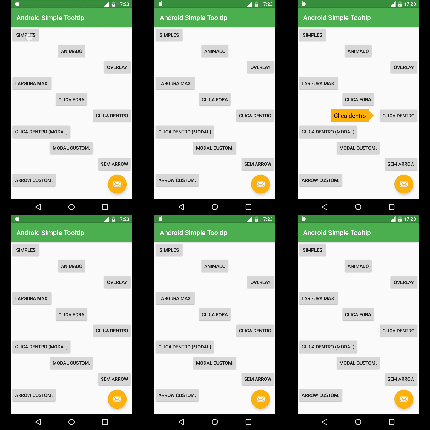
Explore the complete sample app in the sample directory.
Add JitPack to your root build.gradle at the end of repositories:
allprojects {
    repositories {
        google()
        mavenCentral()
        maven { url 'https://jitpack.io' }
    }
}
Note
For projects using Gradle 7+ with dependencyResolutionManagement in settings.gradle:
dependencyResolutionManagement {
    repositoriesMode.set(RepositoriesMode.FAIL_ON_PROJECT_REPOS)
    repositories {
        google()
        mavenCentral()
        maven { url 'https://jitpack.io' }
    }
}dependencies {
implementation 'com.github.douglasjunior:android-simple-tooltip:1.1.0'
}To use the latest snapshot build from the master branch:
dependencies {
    implementation('com.github.douglasjunior:android-simple-tooltip:master-SNAPSHOT') {
        changing = true // Gradle will check for updates every 24 hours
    }
}Anchors to a target view and displays a simple message:
View yourView = findViewById(R.id.your_view);

new SimpleTooltip.Builder(this)
    .anchorView(yourView)
    .text("Hello World!")
    .gravity(Gravity.END)
    .build()
.show();Enables a smooth bouncing translation animation:
new SimpleTooltip.Builder(this)
    .anchorView(yourView)
    .text(R.string.tip_text)
    .gravity(Gravity.TOP)
    .animated(true)
    .animationDuration(1000)
    .animationPadding(SimpleTooltipUtils.pxFromDp(6))
    .build()
.show();Darkens the surrounding screen while highlighting the anchor view with an oval or rounded-rectangular spotlight:
new SimpleTooltip.Builder(this)
    .anchorView(yourView)
    .text("Focus attention on this element")
    .gravity(Gravity.START)
    .animated(true)
    .transparentOverlay(false)
    .highlightShape(OverlayView.HIGHLIGHT_SHAPE_RECTANGULAR_ROUNDED)
    .cornerRadius(20)
    .overlayOffset(0)
    .overlayWindowBackgroundColor(Color.BLACK)
    .build()
.show();Prevent users from interacting with the background while the tooltip is visible:
new SimpleTooltip.Builder(this)
    .anchorView(yourView)
    .text("Modal tooltip: tap inside to dismiss")
    .gravity(Gravity.BOTTOM)
    .modal(true)
    .dismissOnInsideTouch(true)
    .dismissOnOutsideTouch(false)
    .build()
.show();Inflate a custom layout with custom views, action buttons, or text fields:
final SimpleTooltip tooltip = new SimpleTooltip.Builder(this)
    .anchorView(yourView)
    .gravity(Gravity.TOP)
    .modal(true)
    .animated(true)
    .contentView(R.layout.tooltip_custom, R.id.tv_text)
    .focusable(true)
    .build();

// Access views inside the custom layout
Button btnNext = tooltip.findViewById(R.id.btn_next);
EditText edText = tooltip.findViewById(R.id.ed_text);

btnNext.setOnClickListener(v -> {
    tooltip.dismiss();
    // Do something with edText.getText()
});

tooltip.show();Customize or remove the indicator arrow:
// Without arrow
new SimpleTooltip.Builder(this)
    .anchorView(yourView)
    .text("No arrow")
    .gravity(Gravity.CENTER)
    .showArrow(false)
    .build()
    .show();

// Custom arrow drawable and size
new SimpleTooltip.Builder(this)
    .anchorView(yourView)
    .text("Custom arrow")
    .gravity(Gravity.END)
    .arrowDrawable(R.drawable.ic_custom_arrow)
    .arrowWidth(SimpleTooltipUtils.pxFromDp(32))
    .arrowHeight(SimpleTooltipUtils.pxFromDp(32))
    .build()
.show();When showing tooltips inside a dialog, set overlayMatchParent(false) so the overlay respects the dialog's bounds:
new SimpleTooltip.Builder(activity)
    .anchorView(btnInDialog)
    .text("Tip inside a Dialog")
    .gravity(Gravity.BOTTOM)
    .animated(true)
    .transparentOverlay(false)
    .overlayMatchParent(false)
    .build()
.show();You can override default styling globally across your app by defining these resources in your project's res/values/:
<resources>
    <!-- Tooltip bubble background color -->
    <color name="simpletooltip_background">@color/colorAccent</color>
    <!-- Tooltip default text color -->
    <color name="simpletooltip_text">@android:color/primary_text_light</color>
    <!-- Indicator arrow color -->
    <color name="simpletooltip_arrow">@color/colorAccent</color>
</resources><resources>
<dimen name="simpletooltip_overlay_offset">10dp</dimen>
<dimen name="simpletooltip_margin">10dp</dimen>
<dimen name="simpletooltip_padding">8dp</dimen>
<dimen name="simpletooltip_arrow_width">30dp</dimen>
<dimen name="simpletooltip_arrow_height">15dp</dimen>
<dimen name="simpletooltip_animation_padding">4dp</dimen>
</resources><resources>
<!-- Overlay backdrop darkness (0 to 255) -->
<integer name="simpletooltip_overlay_alpha">120</integer>
<!-- Duration of one animation cycle in milliseconds -->
<integer name="simpletooltip_animation_duration">800</integer>
</resources>Override simpletooltip_default in your app to customize default text appearance (the library style inherits @android:style/TextAppearance.Medium):
<resources>
    <style name="simpletooltip_default" parent="@android:style/TextAppearance.Medium">
        <!-- Example text appearance customizations -->
        <item name="android:textSize">14sp</item>
        <item name="android:textColor">@color/simpletooltip_text</item>
    </style>
</resources>| Method | Type / Parameter | Default | Description |
|---|---|---|---|
anchorView(View) |
View |
Required | Target view that the tooltip will point to. |
text(CharSequence) |
CharSequence |
"" |
Text displayed in the tooltip. |
text(@StringRes int) |
int |
String resource ID for the tooltip text. | |
gravity(int) |
Gravity.TOP / BOTTOM / START / END / CENTER |
Gravity.BOTTOM |
Side relative to the anchor where the tooltip appears. |
animated(boolean) |
boolean |
false |
Enables floating bounce animation (API 11+). |
animationDuration(long) |
long (ms) |
800 |
Duration of each animation cycle. |
animationPadding(float) |
float / @DimenRes int |
4dp |
Travel distance of the animation in pixels. |
transparentOverlay(boolean) |
boolean |
true |
When false, darkens the screen backdrop with a spotlight. |
highlightShape(int) |
OverlayView.HIGHLIGHT_SHAPE_* |
OVAL |
Shape of the spotlight cutout (OVAL, RECTANGULAR, RECTANGULAR_ROUNDED). |
cornerRadius(float) |
float |
0 |
Corner radius for rounded rectangular spotlight cutouts. |
overlayOffset(float) |
float (px) |
10dp |
Extra spacing between the anchor view and the spotlight cutout edge. |
overlayWindowBackgroundColor(int) |
@ColorInt int |
Color.BLACK |
Base color of the darkened backdrop overlay. |
overlayMatchParent(boolean) |
boolean |
true |
Set to false for dialogs/fragments so the overlay fits the dialog bounds. |
ignoreOverlay(boolean) |
boolean |
false |
Completely skips adding the overlay view to the root view hierarchy. |
modal(boolean) |
boolean |
false |
Blocks touch events on background views while the tooltip is open. |
dismissOnInsideTouch(boolean) |
boolean |
true |
Dismisses the tooltip when clicked inside its bubble. |
dismissOnOutsideTouch(boolean) |
boolean |
true |
Dismisses the tooltip when clicked outside its bubble. |
showArrow(boolean) |
boolean |
true |
Whether to display the indicator arrow. |
arrowDirection(int) |
ArrowDrawable.* |
AUTO |
Arrow direction (AUTO, TOP, BOTTOM, LEFT, RIGHT). |
arrowColor(int) |
@ColorInt int |
Resource default | Tint color for the default arrow drawable. |
arrowDrawable(Drawable) |
Drawable / @DrawableRes int |
Default shape | Custom drawable used as the indicator arrow. |
arrowWidth(float) |
float |
30dp |
Arrow base width in pixels. |
arrowHeight(float) |
float |
15dp |
Arrow height in pixels. |
contentView(View, int) |
View, @IdRes int |
Default TextView | Custom view with an optional text view ID. |
contentView(@LayoutRes int, int) |
int, @IdRes int |
Layout resource to inflate with an optional text view ID. | |
backgroundColor(int) |
@ColorInt int |
Resource default | Background color of the default content bubble. |
textColor(int) |
@ColorInt int |
Resource default | Text color for the default text view. |
maxWidth(float) |
float / @DimenRes int |
0 (unlimited) |
Maximum width constraint for the tooltip bubble. |
margin(float) |
float / @DimenRes int |
10dp |
Margin between the anchor view and the tooltip bubble. |
padding(float) |
float / @DimenRes int |
8dp |
Internal padding within the tooltip bubble. |
focusable(boolean) |
boolean |
Non-touch: true |
Enables keyboard/D-pad navigation focus on non-touch devices. |
onDismissListener(listener) |
OnDismissListener |
null |
Callback invoked when the tooltip is dismissed. |
onShowListener(listener) |
OnShowListener |
null |
Callback invoked when the tooltip is displayed. |
build() |
SimpleTooltip |
Validates parameters and constructs the SimpleTooltip instance. |
| Method | Return Type | Description |
|---|---|---|
show() |
void |
Displays the tooltip on screen anchored to the configured view. |
dismiss() |
void |
Dismisses and cleans up the tooltip, overlay, and animations. |
isShowing() |
boolean |
Returns true if the tooltip popup is currently visible. |
findViewById(@IdRes int id) |
<T extends View> T |
Finds a view within the tooltip's inflated content layout. |
Check the Javadoc documentation for full class references.
-
IllegalArgumentException: Could not lock surface- Cause: Occurs if a hosting
ActivityorDialogis closed while the tooltip's floating animation is still running. - Impact: Does not crash or impact app stability. The library automatically catches and cleans up listeners upon dismissal.
- Cause: Occurs if a hosting
-
android.view.WindowLeaked- Cause: Occurs if
tooltip.show()is triggered after the parentActivityhas already begun finishing or destroying. Refer to the StackOverflow discussion. - Prevention: Always check
!isFinishing()or dismiss the tooltip in youronDestroy()/onStop()lifecycle callback.
- Cause: Occurs if
-
PopupWindow.setClippingEnabledon Android 7.0+ (API 24+)- Cause: Beginning in Android Nougat (API 24), the platform modified how
PopupWindowclips contents against screen boundaries, which may crop popups near the edges. - Workaround: Adjust margin offsets or refer to Issue #40 for specific boundary handling.
- Cause: Beginning in Android Nougat (API 24), the platform modified how
Contributions, bug reports, and pull requests are warmly welcomed!
- Read the sample project and inspect
SimpleTooltip.java. - Fork the repository and create your topic branch (
git checkout -b feature/my-feature). - Verify that Gradle build and checks pass:
./gradlew build connectedCheck
- Open a pull request describing your improvements.
For questions and suggestions, please open an Issue.
If this library helped your project, consider supporting the maintainer:


The MIT License (MIT)

Copyright (c) 2016 Douglas Nassif Roma Junior
See the full LICENSE file for details.

Discover more open-source libraries, creative animation engines, and developer tools at douglasjunior.work.